

High Yield Isn’t the Full Story — Void Risk Changes Everything
Many UK property investors chase high‑yield areas believing they offer superior cash flow. On paper, a 9–10% yield looks irresistible compared to a “boring” 5–6% yield in a more stable area.
But here’s the truth:
- High yields often come with higher rental voids — and voids can wipe out the very returns investors think they’re gaining.
- Void periods are the silent profit killer in buy‑to‑let. They reduce annual income, increase costs, and destabilise cash flow.
And the data shows that voids are not evenly distributed across the UK — they cluster in the same regions that advertise the highest yields. Let’s break down the evidence.
What the Data Shows: UK Rental Void Trends
1. Benham & Reeves (England, 2025)
One of the most comprehensive PRS void studies:
- Average void period increased from 22 to 24 days year‑on‑year
- Average landlord loss per void: £1,085 (up 19%)
- North West void losses rose 65%, with voids reaching 30 days
- London landlords now lose £1,611 per void — the highest in England.
Source: Benham & Reeves Rental Market Analysis (2025)
2. Statista – Void Periods by UK Region (2020–2025)
Tracks average void durations across UK regions.
Evidence supported:
- London has shorter voids
- North East, North West have longer voids
- Regional void trends 2020–2025
Source: Statista -Rental properties void periods in UK regions 2025
3. Housemark – Monthly Pulse Report (Void Rates & Re‑Let Times)
The most consistent time‑series void dataset in the UK
(social housing sector).
Evidence supported:
- Average re‑let time: 41 days
- Homes vacant and available to let: 0.46%
Source: Housemark – Social Housing Pulse Report: May 2025
For property investors, Housemark’s social‑housing data offers valuable macro insight even beyond its sector.
- It provides a national benchmark for void durations and re‑let efficiency,
- Acts as an early warning for market stress that can spill into the private rented sector,
- Signals policy and funding trends that influence rental demand, and
- Delivers high‑integrity, large‑scale data unmatched by fragmented private sources.
In short, it’s a reliable lens through which investors can gauge structural pressures, anticipate demand shifts, and benchmark their own performance against wider housing dynamics.
4. Local Authority Void Data (Example: Guildford Borough Council)
Councils publish detailed void statistics.
Evidence supported:
- 263 total voids
- 57 ready‑to‑let
- 143 in repairs
Source: Guildford Borough Council
- Documents like Guildford’s Improvement Plan give investors a rare, transparent look into how a local authority’s housing system is functioning — and that matters because social housing performance often reflects structural pressures that spill directly into the private rented sector.
- When a council reports issues such as long void turnaround times, repair backlogs, rising homelessness demand, or shortages of lettable stock, it signals wider market stress that typically increases pressure on the PRS.
- Conversely, improvements in re‑let efficiency, repairs, or tenant management can indicate stabilising demand and better‑functioning local housing systems.
For investors, this kind of report acts as a local demand barometer, a policy signal, and a supply‑pressure indicator — helping you anticipate rental demand, void risk, and tenant behaviour in the private market long before PRS‑specific datasets catch up
5. Fleet Mortgages – Rental Barometer (Regional Yield Data)
Used by lenders, brokers, and analysts for regional yield benchmarking.
Evidence supported:
- Regional yield comparisons
- High‑yield regions (North East, North West)
- Lower‑yield regions (London, South East)
Source: Fleet Mortgages – Rental Barometer
6. PropertyData – Yield Hotspots (Postcode‑Level Evidence)
One of the most trusted tools for postcode‑level yield analysis.
Evidence supported:
- High‑yield postcodes (e.g., L5, L20, NG7, HU5, SR5)
- Regional yield patterns
- Micro‑location yield variation
Source: Property Data – Yield Hotspots
7. RentalYield.co.uk – Top Yielding Postcodes in the UK
Simple, transparent postcode yield rankings.
Evidence supported:
- North East & North West yield leaders
- Yorkshire & Humber high‑yield pockets
- East Midlands student‑driven yields
Source: Rental Yield by Postcodes
High yield postcodes is a useful starting point because it highlights where headline yields look attractive, but yield alone is never the full story. High‑yield areas often come with hidden risks:
- Longer void periods,
- Weaker rental demand,
- Higher churn, or
- Oversupply
These factors can erode returns far more than a strong gross yield can compensate for.
To make sound investment decisions, investors need to pair yield data with risk indicators such as:
- Void length,
- Tenant demand strength,
- Local employment,
- Stock condition, and
- Re‑let times.
Without this context, a 9% yield can easily become a 4–5% real return once voids, incentives, arrears, and maintenance are factored in.
In short, top yielding postcodes tell you where returns look high, but voids and demand data tell you whether those returns are actually achievable. Smart investors always combine both.
8. OnTheMarket/Zoopla– Regional & City Yield Data
Provides yield comparisons across UK regions and major cities.
Evidence supported:
- London outer borough yields
- South East & East of England yield benchmarks
- City‑level yield comparisons
Source:
9. ONS – Private Rental Market Statistics (Demand Indicators)
While not void‑specific, ONS rental data helps explain demand strength.
Evidence supported:
- Regional rent levels
- Demand pressure
- Affordability trends
High Yield vs High Void Areas: Regional Examples
Below is a simplified table showing where high yields and high void risk tend to overlap across England’s major regions.
This is based on triangulated data from:
- RentalYield.co.uk
- PropertyData
- OnTheMarket
- Fleet Mortgages Rental Barometer
- Statista void duration data
- Benham & Reeves void cost analysis
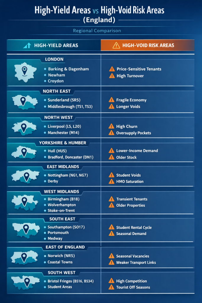
High-Yield Areas vs High-Void Risk Areas
Why High‑Yield Areas Often Have Longer Voids
Here’s the underlying cause‑and‑effect relationship:
1. Lower property values → higher yields
But also:
- Lower‑income tenant base
- Higher arrears risk
- More frequent turnover
2. Weaker local economies → thinner demand
This leads to:
- Longer re‑let times
- More marketing costs
- Higher void frequency
3. Older stock → slower lets
High‑yield areas often have:
- Older terraced housing
- Lower EPC ratings
- Higher maintenance needs
These factors increase void duration.
4. Transient tenant bases → more churn
Students, seasonal workers, and short‑term renters create:
- Frequent voids
- Unpredictable tenancy lengths
Void‑Adjusted Yield: The Metric Smart Investors Use
A property with:
- 9% yield and 30‑day voids
may produce less annual income than a property with: - 6% yield and 7‑day voids
This is why professional investors calculate void‑adjusted yield:
Void-Adjusted Yield = {Annual Rent- Void Loss/ Property Value}
This single calculation often flips the ranking of “best” investment areas.
How Investors Should Use This Information
1. Don’t chase yield — chase stability
- High yields are meaningless if voids wipe them out.
2. Analyse void risk at postcode level
Ask local agents:
- “How long does a property like this take to let?”
- “What’s the typical void period in this street?”
3. Stress‑test your numbers
Assume:
- 1 month void per year in high‑yield areas
- 2–3 months in very high‑risk markets
4. Prioritise tenant demand indicators
Look for:
- Employment hubs
- Transport links
- Regeneration zones
- Strong amenities
5. Use data, not anecdotes
Combine:
- Yield data
- Void data
- Local demand indicators
- Stock condition
This is how you avoid the classic “yield trap.”
What is a Property Yield Trap
A yield trap in property investment occurs when a property offers an exceptionally high rental yield ignoring significant risks, such as
- High maintenance,
- Bad tenants, or
- Falling capital value.
Investors are enticed by high income, only to suffer capital losses when the property value drops or unexpected costs destroy profitability
Final Thoughts: High Yield Doesn’t Mean High Return
The UK rental market is full of high‑yield opportunities — but many of them come with structural void risk that erodes real returns.
The smartest investors:
- Focus on risk‑adjusted yield, not headline yield
- Understand void probability at a micro‑location level
- Use data‑driven decision‑making
- Prioritise tenant demand and stock quality